
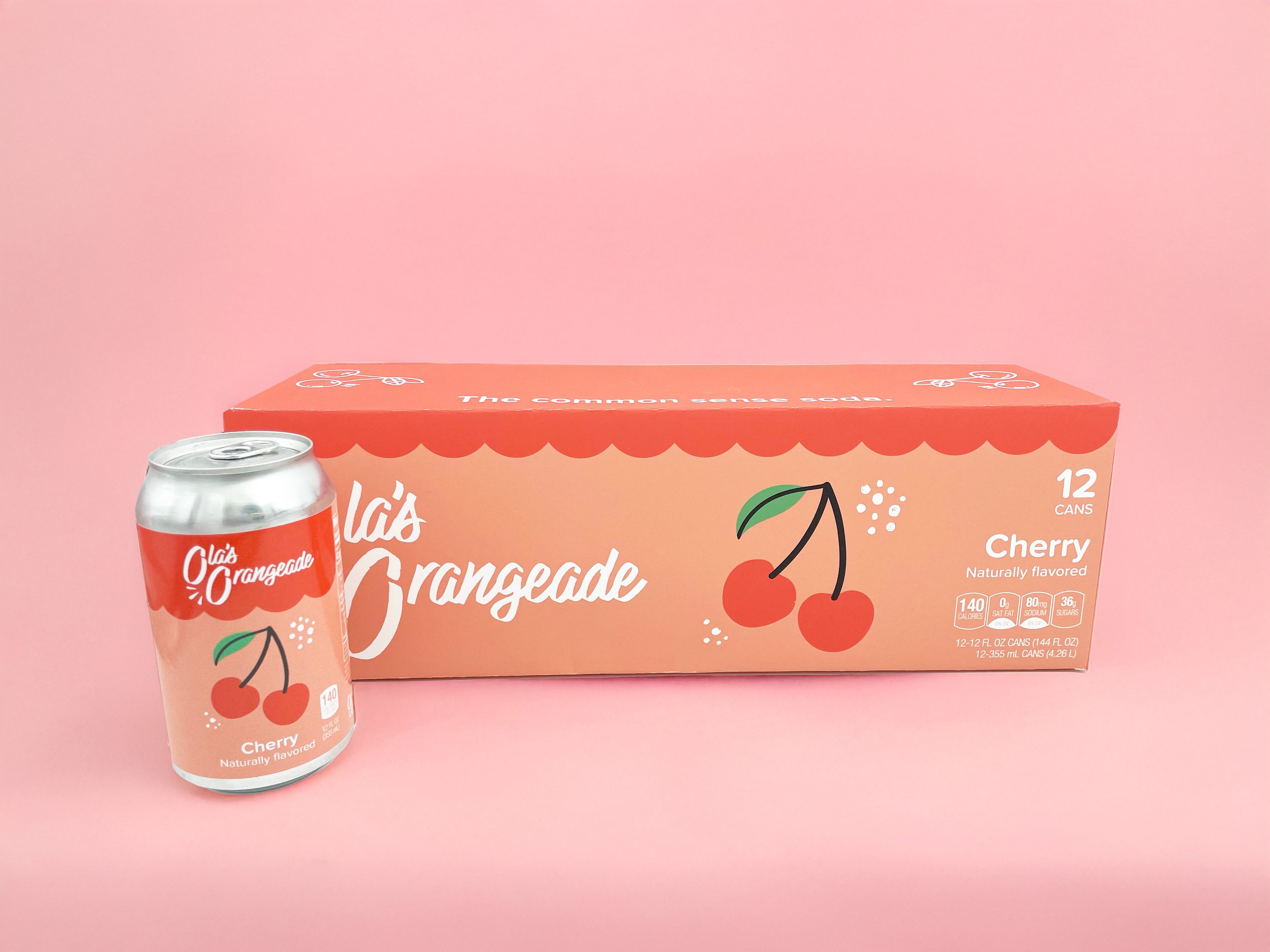
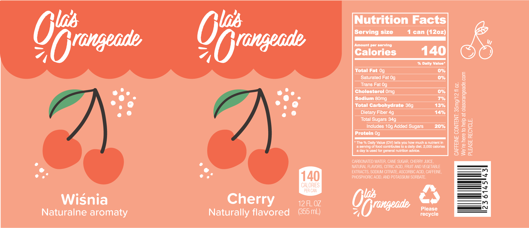
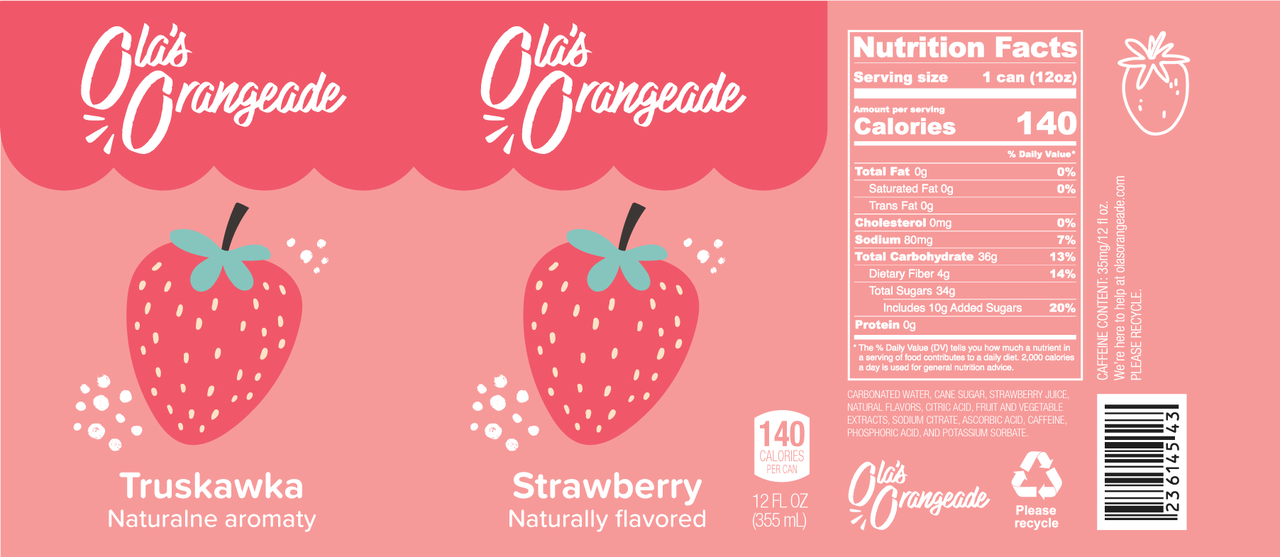
Ola’s Orangeade
Adobe Illustrator, InDesign and Photoshop
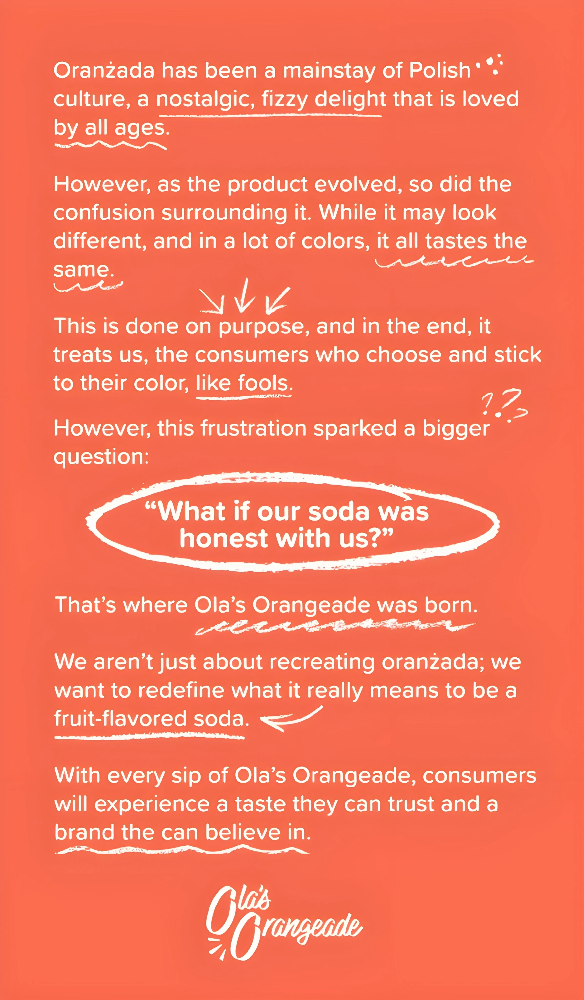
Oranzada, or orangeade, is a Polish soda fondly remembered by many as a childhood treat, especially among older generations.
Ola's Orangeade is an attempt to introduce oranzada to an audience outside of Poland, but in a way that distances it from its current brand presentation, which can be considered deceptive.
Mission Statement
Our mission is to deliver a soda made with recognizable ingredients, honest intentions, and a flavor that speaks for itself, free from artificial additives, misleading promises, or empty nostalgia.
We believe oranzada can evolve into a drink that respects both its heritage and today’s demand for mindful consumption.
Target Audience
The audience for this product is international, mainly American, teens and young adults who are looking for a new, refreshing soft drink but are looking for a more “real” product in comparison to what they already know.
The age range for this audience would specifically be between 16 and 24 years old, which is part of the “Generation Z” age group.
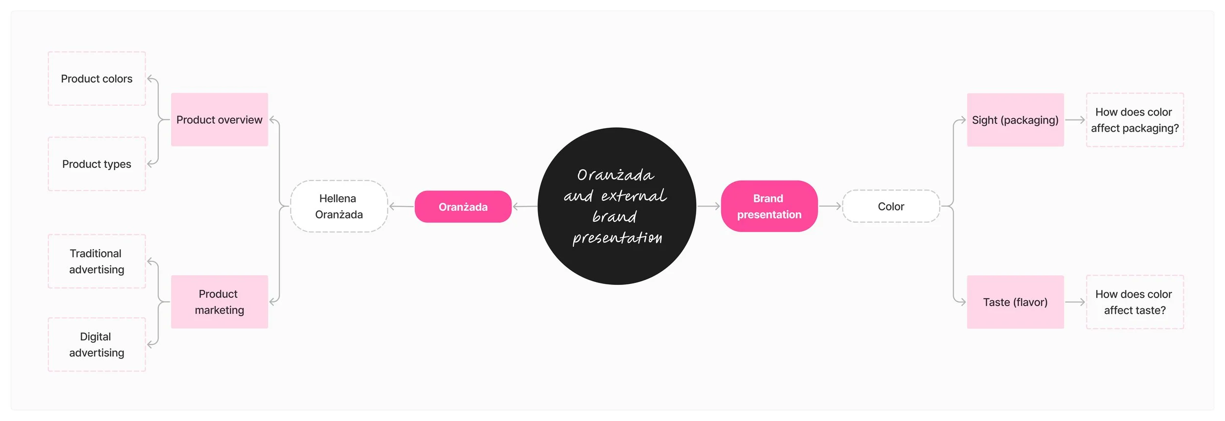
Preliminary Research
My preliminary research involved looking into how brand presentation, specifically through color, effected both sight (via packaging) and taste (via flavor) while also looking into Hellena oranzada, arguably the most popular brand of oranzada.
Secondary Research
Research Question
How does the external presentation of oranzada influence its overall consumer perception?
Strategic Use of Colour in Brand Packaging
Hannele Kauppinen-Räisänen (2014)
Up to 90% of consumers make a purchase decision based on visual examination.
Packaging uses color to draw attention, add aesthetic appeal, and communicate a message.
The message that color communicates varies by age, gender, and racial ethnicity.
Confusing packaging makes people less likely to buy a product.
“A company packaged their pharmaceutical product in a yellow bottle with white and black labelling, only to find that the colours conveyed negative meanings, as they were also used for ant poison packaging."
Human Perception and the Color of Flavor
Kala Sherman (2023)
Consumers assumed they were drinking Coca-Cola when it was Pepsi because it was in a Coca-Cola bottle.
60 participants were given Pepsi in a Coca-Cola bottle and Coca-Cola in a Pepsi bottle, and then asked to guess what they just drank.
Despite having distinct tastes, people used packaging to determine what soda they just drank.
Strong brand packaging can influence a person’s consumption experience.
This phenomenon even effects “important” brands like Coca-Cola and Pepsi.
Pepsi versus Coke: Labels, Not Tastes, Prevail
Woolfolk, M. E., Castellan, W., & Brooks, C (1983)
Every person’s taste interacts with vision to form the overall perception.
The specific color of a drink can impact the way one perceives the taste of a drink when consuming it.
When given red-colored blueberry-flavored gelatin, more then half of the respondants still guessted “strawberry” even after trying it because, simply: it was red, and “blueberry” is blue.
When guessing the flavor of a product, consumers will use color as one of the strongest deciding factors.
Inappropriate coloring of a flavored product will turn people off from buying it.
Primary Research
I conducted a focus group with four participants of diverse genders and racial backgrounds, asking them to guess the flavor of the different colors of oranzada before and after drinking it, with and without glancing at the bottle's label, and observing how their answers varied.
Patterns
Color and smell influence initial perceptions
Before tasting, participants relied heavily on color and smell to guess flavors.
Uncertainty and shifting opinions after tasting
Many participants changed their guesses after tasting.
Some flavors, like red (cherry/strawberry/blueberry) and yellow (apple/grape), caused confusion.
The clear drink was particularly ambiguous, with guesses ranging from lemon to apple.
Aftertaste and smell affect perceived flavor
Some participants noted that aftertaste influenced their perception.
Others believed that the smell altered the taste experience: “I think the smell is making it taste different.”
Doubt and confusion after seeing the packaging
Participants expressed skepticism and felt misled by the uniform packaging.
Reactions included, “Have we been tricked? Have we been bamboozled?”
The label’s vagueness (e.g., “red drink”) led to further frustration and a lack of clarity.
Packaging lacks clarity and impacts purchase decisions
Key concerns:
Lack of flavor identification (“There’s no flavor on the packaging.”)
The packaging is too vague or unappealing (“I don’t like the packaging.”).
Uncertainty about flavors affecting purchase decisions (“What if I don’t like strawberry-flavored things?”).
Insights
The participants already had their associations of color with flavor.
“There’s going to be an apple one, there’s going to be a cherry—did you say cherry?”
“This is cherry, apple, and lemon.”
“Yes, because [the packaging] is the same and all red, so it makes me think the flavor is ‘red’.”
All of the participants associated red with “berry” flavors, including strawberry, blueberry, and cherry before and after trying it.
“(after seeing packaging) I still think it’s cherry.”
“Yes, because [the packaging] is the same and all red, so it makes me think the flavor is ‘red’.”
Participants started assuming the flavors were the same/similar after seeing the label when they originally stated otherwise.
“I think the smell is making it taste different because when I smell it, it’s different.”
“These two just taste the same to me now.”
They expressed immediate dissatisfaction when they felt the original packaging was deceitful, and stated they would not buy the product despite enjoying it.
“No, I don’t like the packaging, if I’m being picky.”
“[It says] ‘red drink!’ to me.”
“There’s no… I mean… they’re all the same color [and] label.”
Problem Statement
A consumer who is interested in purchasing oranzada needs to see what exactly makes the product different from its competitors because the current external presentation is not helping them.
Brand Guidelines
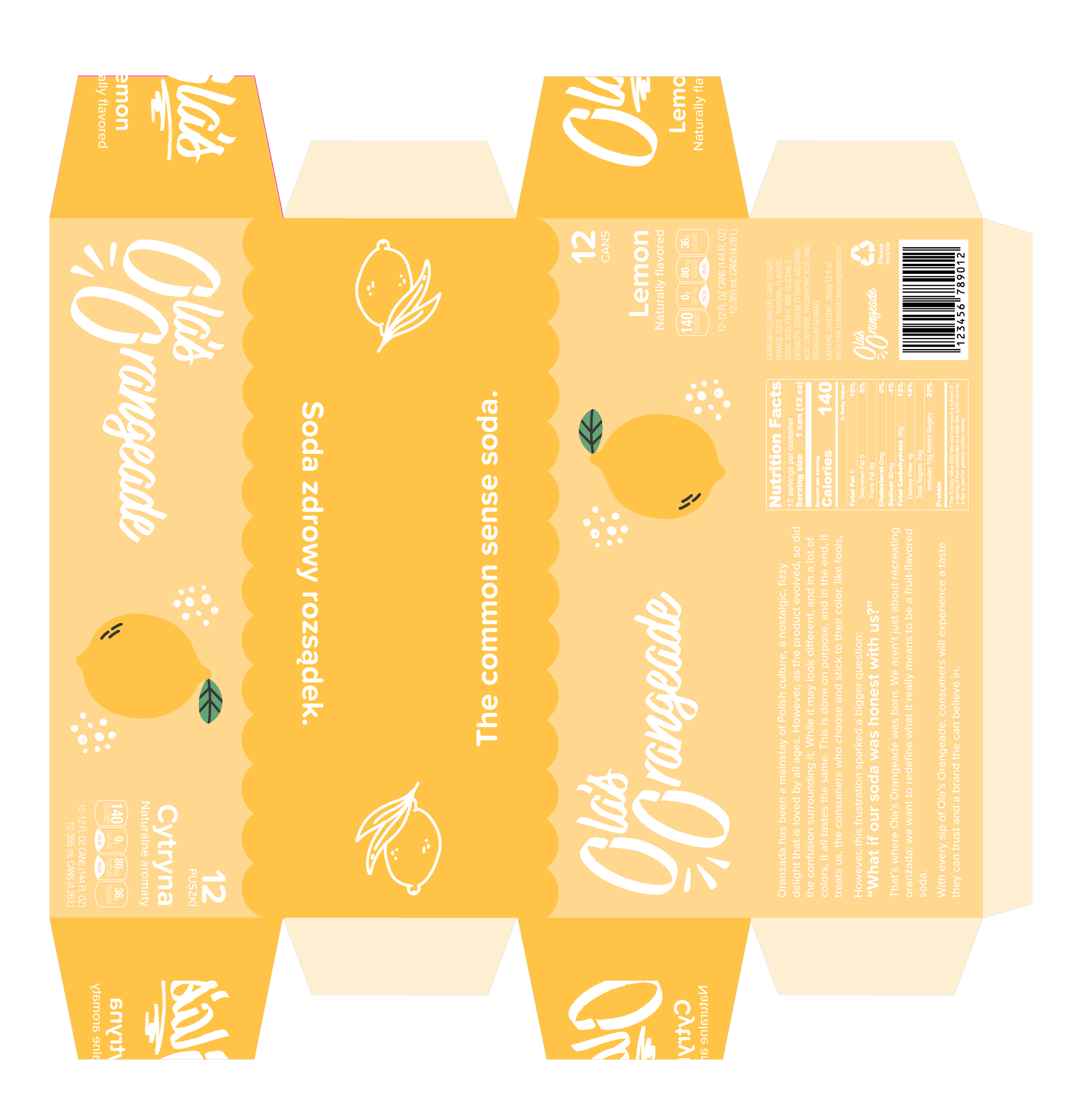
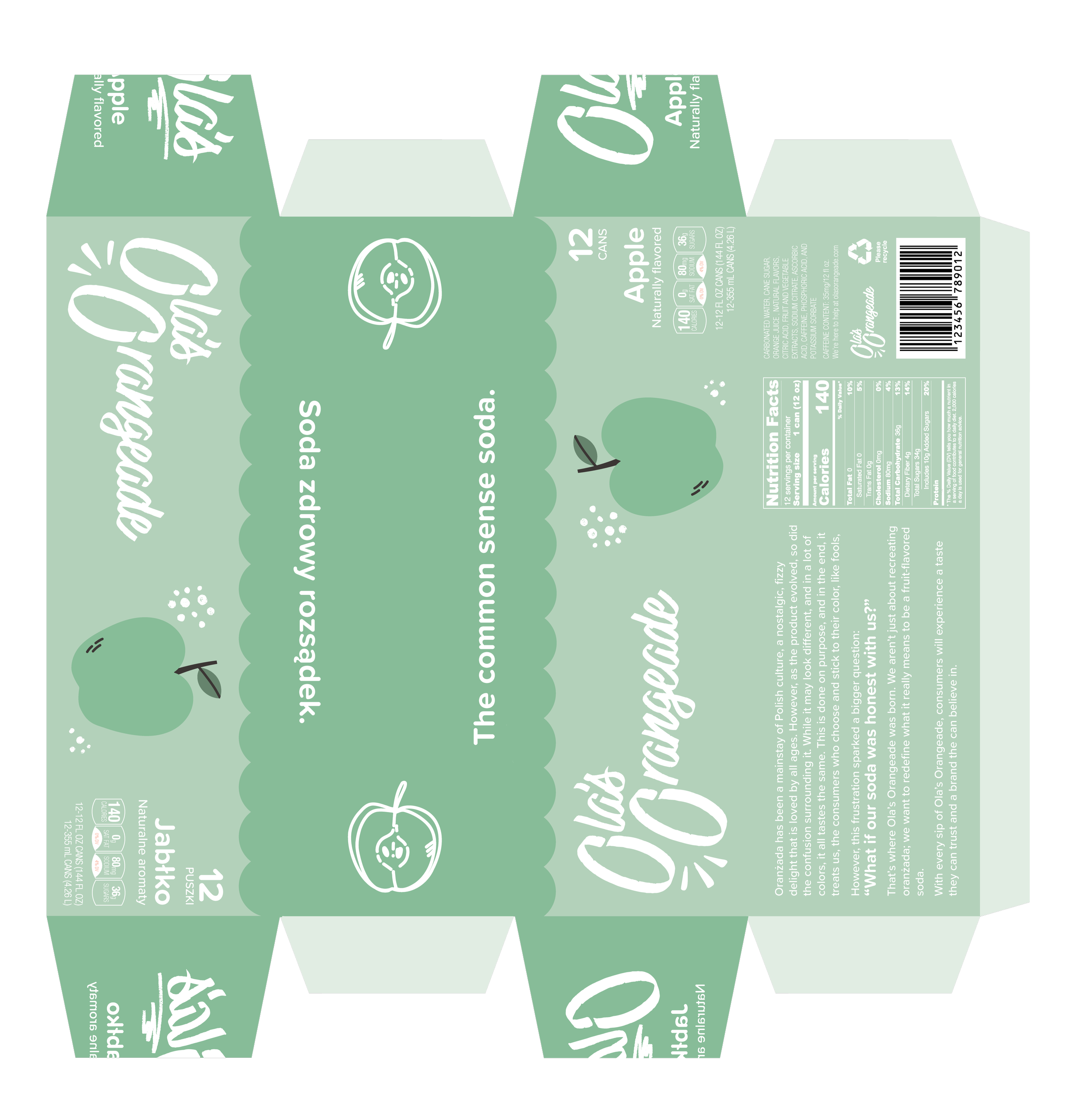
Soda Packaging
12 oz Cans


20 oz Bottles


12 Pack of Cans


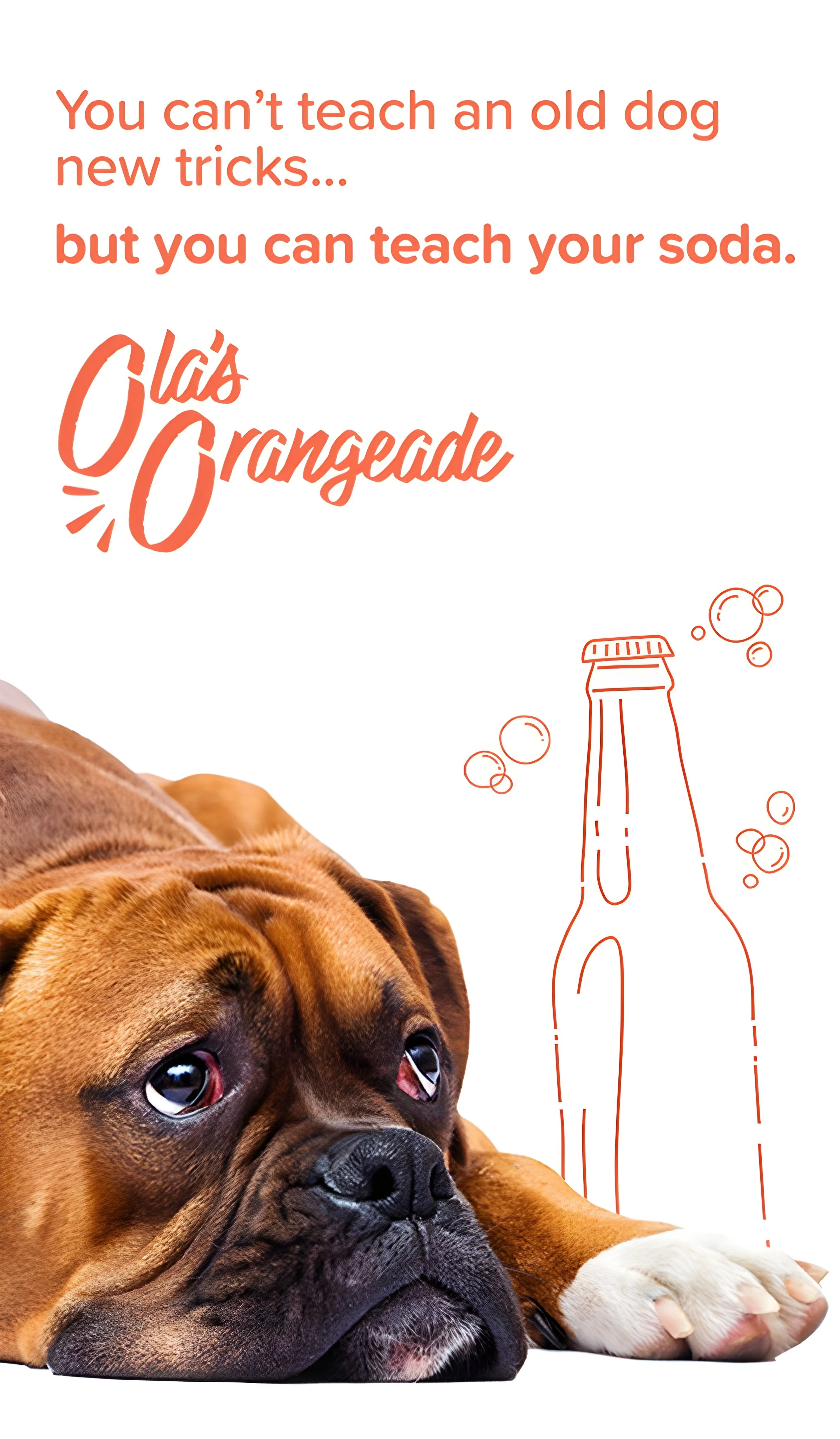
Product Advertisements
Vertical Billboards


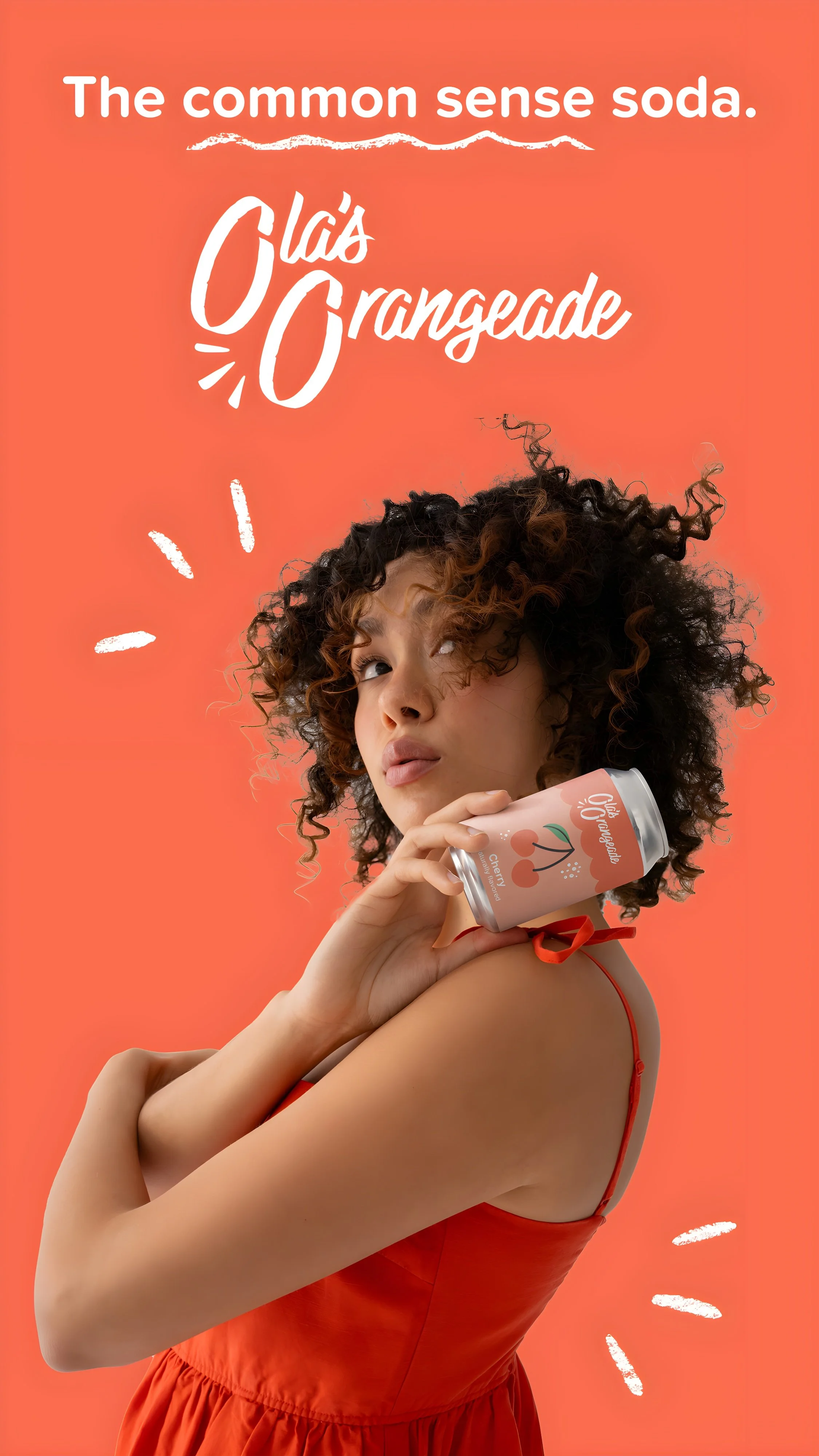

Promotional Posters
Exhibition
Both packaging design and marketing materials for Ola’s Orangeade were featured at the 2025 Bachelor’s of Fine Arts Exhibition at Krannert Art Museum.
